|
|
#21 |
|
the end of the ugly
Join Date: Sep 2006
Location: finland
Posts: 945
           |
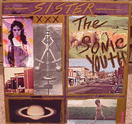
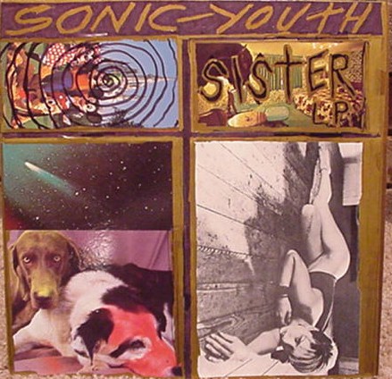
sister and evol are best, both sleeves and music. but why did they change the back side of sister to front on the cd-version? also it sucks that some of the images has been removed.
 ciccone youth lp has got a nice cover too. |
|
|
|QUOTE AND REPLY| |
|
|
#22 |
|
expwy. to yr skull
Join Date: Apr 2006
Location: Cardiff, Spiderland
Posts: 1,465
           |
I Gotta go with Sonic Youth's two most iconic covers (and the ones that best represent the sound of the music)
 
__________________
....Of Course its some kinda cosmic payback for being too ironic! |
|
|
|QUOTE AND REPLY| |
|
|
#23 |
|
invito al cielo
Join Date: Mar 2006
Location: Lexington,KY USA
Posts: 2,512
           |
 |
|
|
|QUOTE AND REPLY| |
|
|
#24 | |
|
invito al cielo
Join Date: Mar 2006
Posts: 9,527
           |
Quote:
And there was something done to the Disney picture as well, I think, because of fears about legal action from Disney Corp. |
|
|
|
|QUOTE AND REPLY| |
|
|
#25 |
|
invito al cielo
Join Date: Apr 2006
Location: Plaza de Toros
Posts: 6,731
           |
I like most of them, but EVOL is my fav.
 |
|
|
|QUOTE AND REPLY| |
|
|
#26 |
|
invito al cielo
Join Date: Mar 2006
Location: psycho battery
Posts: 12,161
           |
i like all of them to be honest. they all have their own unique qualities. the one i like least is probably murray street.
ok my faves are bad moon rising and nyc ghosts and flowers.
__________________
Sarcasm[A] is stating the opposite of an intended meaning especially in order to sneeringly, slyly, jest or mock a person, situation or thing |@ <------- Euphoric brain cell just moments before expiration V _ \ / _ PING <-------- moments later / \ http://media.tumblr.com/tumblr_ljhxq...isruo1_500.gif |
|
|
|QUOTE AND REPLY| |
|
|
#27 |
|
invito al cielo
Join Date: Mar 2006
Posts: 9,527
           |
If I had to frame one and hang it on my wall, it would probably be SYR4. If it had to be a "proper" album, then NYCG+F.
I used to have this back cover painted on the back of a leather jacket, but I let a girlfriend keep it when we split up. It was later stolen.  |
|
|
|QUOTE AND REPLY| |
|
|
#28 |
|
invito al cielo
Join Date: Mar 2006
Posts: 9,527
           |
I think the Disney may have been done before the album was first released.
|
|
|
|QUOTE AND REPLY| |
|
|
#29 |
|
invito al cielo
Join Date: Mar 2006
Location: psycho battery
Posts: 12,161
           |
it was to do with the disney image. i dont think that they actually got any shit from them but they were scared of it so they changed it. i may be wrong though.
didnt anyone complain of the image of the kid running around naked? i seem to remember reading that someone was offended by it.
__________________
Sarcasm[A] is stating the opposite of an intended meaning especially in order to sneeringly, slyly, jest or mock a person, situation or thing |@ <------- Euphoric brain cell just moments before expiration V _ \ / _ PING <-------- moments later / \ http://media.tumblr.com/tumblr_ljhxq...isruo1_500.gif |
|
|
|QUOTE AND REPLY| |
|
|
#30 |
|
invito al cielo
Join Date: Mar 2006
Posts: 9,527
           |
From the Mustang site:
  Depending on how you look at it, "Sister" has 2 covers, neither a clear back/front, but the CD version does use the "XXX Cattle" shot for the front. Its original cover was immediately controversial -- a bright, almost out of place photograph of a girl by Richard Avedon in the upper left corner was removed after Avedon threatened to sue. Initially they just placed black stickers over the jacket art, and blacked it out completely on subsequent pressings. There was some record label paranoia regarding the potential threat of Disney suing over the shot of Mickey, Minnie, Goofy and Pluto at the Magic Kingdom, so it was spiralled out and UPC-ed over (the liners claim "cover photos from public domain jacked from sonic matrix"). http://www.sonicyouth.com/mustang/lp/lp5.html |
|
|
|QUOTE AND REPLY| |
|
|
#31 |
|
expwy. to yr skull
Join Date: Nov 2006
Location: Eye Of The Squirrel
Posts: 1,481
           |
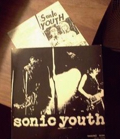
I think both Sister and Experimental suit their music. There is something about the Brown paint on the Sister cover that suits the warmth of the drums on Schizophrena and the analogue feel of the record...It might have been wiser to dim down those disney photos as they are too colourful
As for Experimental the card inlay offering fans a different cover art was brilliant....I see it is used record shops at it always cathces my eye with the different colours. Again that maroon really suits the music... However, IMO the best cover art is the 1000 leaves....There pull no punches with that cover Murray streets inside photoshopped job is seriosuly lacking effort. The cover image tries to be poignant but fails....The back two one way signs is pretty good though considering the situation etc... |
|
|
|QUOTE AND REPLY| |
|
|
#32 |
|
invito al cielo
Join Date: Mar 2006
Posts: 5,134
           |
cis
bmr evol sister whitey goo nyc |
|
|
|QUOTE AND REPLY| |
|
|
#33 | |
|
invito al cielo
Join Date: Mar 2006
Location: Baltimore
Posts: 7,808
           |
Quote:
__________________
Confusion is next and next after that is the Truth. |
|
|
|
|QUOTE AND REPLY| |